
Key Takeaways
- Keep every page focused on a clear purpose.
- Use simple layouts, hierarchy, and spacing for clarity.
- Make navigation easy and mobile friendly.
- Prioritize speed, accessibility, and usability.
- Add personality without creating clutter.
- Test and refine the design based on user behavior.
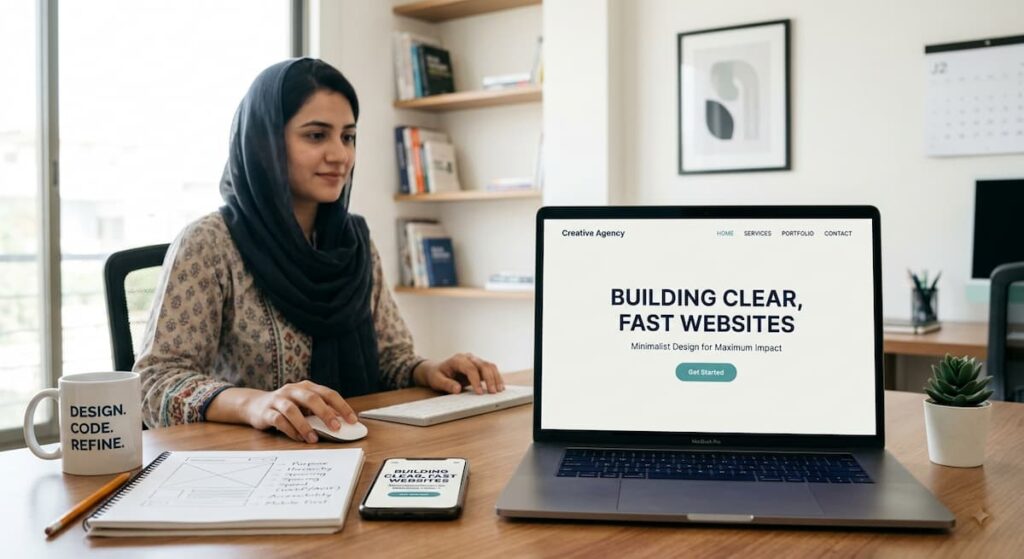
A minimalist website is not one that feels empty. It is one that makes the next step obvious. Visitors should quickly understand what you offer, who it is for, and where to go next. Reviewing effective minimal UI examples can help teams see how focused layouts use space, typography, and restraint to make important information easier to notice.
- Key Takeaways
- Why Clarity Matters In Website Design
- What Minimalism Means On The Web
- Start With One Clear Purpose
- Build A Simple Visual Hierarchy
- Write Clear, Direct Copy
- Make Navigation Easy To Follow
- Design For Better Page Speed
- Support Mobile Users First
- Add Personality Without Adding Clutter
- Check Accessibility Before Launch
- Test, Measure, And Refine
- Conclusion
A clear website is a practical advantage. People often arrive with limited time, a small screen, and a specific question. A calm layout, direct content, and fast loading pages reduce friction, build trust, and give visitors confidence to act.
Why Clarity Matters In Website Design
Visitors form an impression before they read every word. When a homepage contains competing headlines, oversized menus, popups, and too many buttons, people must work to decide what matters. Clear design puts the essential message first and supports it with useful details. Many current website design trends still point toward experiences that are practical, responsive, and easy to use rather than decorative for their own sake.
What Minimalism Means On The Web
Minimalism means that every element has a job. It does not require a white background, minimal copy, or a lack of personality. Instead, it asks whether an image, paragraph, color, animation, or control helps the visitor complete a task. Remove what distracts, keep what explains, and repeat visual patterns consistently across the site.
Start With One Clear Purpose
Before choosing colors or building sections, define the main goal of each page. A service page may need visitors to request a consultation. A product page may need them to compare options and purchase. A portfolio may need them to review work and make contact. Once the goal is clear, place the most useful message and primary call to action near the top, then remove material that does not support that journey.
Build A Simple Visual Hierarchy
Visual hierarchy directs attention through size, contrast, spacing, and position. Begin with one strong headline that explains the page. Place a brief supporting statement beneath it, then provide a single primary button. Use headings to divide longer pages into clear sections, and reserve your strongest accent color for important actions. Generous space between unrelated ideas makes the page easier to process without adding more decoration.
Write Clear, Direct Copy
Website copy should answer questions quickly. Keep paragraphs short, use plain language, and replace vague claims with specific information. Instead of saying a service is “industry leading,” explain what it does, how it works, and who it helps. Break detailed processes into bullet points or numbered steps, use descriptive subheadings, and place answers near the questions visitors are likely to have.
Make Navigation Easy To Follow
Navigation should feel familiar rather than clever. Use labels such as Services, About, Resources, and Contact when they accurately describe the destination. Keep the main menu short, group related pages under understandable categories, and make the logo return visitors to the homepage. Larger sites can benefit from breadcrumbs and useful on site search, but neither should become a substitute for a sensible page structure.
Design For Better Page Speed
Speed is a design decision as much as a technical one. Large images, unnecessary web fonts, autoplay video, complicated effects, and unused scripts can make a simple page feel slow. Compress images before uploading them, choose modern image formats where appropriate, lazy load media below the fold, and test on both mobile data and desktop connections. Regular website speed testing also helps reveal whether visual choices are creating avoidable delays.
Support Mobile Users First
Start with the smallest practical screen and build upward. Arrange content in a clear vertical flow, ensure buttons are easy to tap, and avoid text that becomes too small to read. Test menus, forms, images, tables, and embedded content at several widths. Responsive layouts should adapt naturally rather than squeezing a desktop page into a narrow space.
Add Personality Without Adding Clutter
A simple website can still feel distinct. Choose a focused color palette, use one or two typefaces with clear roles, and select images that reinforce the message. A small studio, for example, may need only a strong project image, a concise statement of its specialty, selected proof of experience and a visible contact button. Small motion effects can add polish when they confirm an action or explain a change, but they should never compete with the content.
Check Accessibility Before Launch
Clean design must work for people using different devices, settings, and assistive technology. Check that the text has sufficient contrast, that meaningful images have useful alternative text, and that keyboard focus remains visible. Every form field needs a label, errors should not rely on color alone, headings should follow a logical order, and motion should respect reduced motion preferences. Accessibility improvements usually make the site clearer for everyone.
Test, Measure, And Refine
Personal preference is not enough to prove that a design works. Ask a few people to complete the main task and observe where they hesitate, misread a label, or abandon a form. Review mobile performance, form completion, search behavior, and page engagement. Compare alternative headlines or button labels when there is a genuine question to answer, then remove elements that are rarely used or cause confusion.
Conclusion
Effective minimalist design is about careful choices, not simply removing content. Give every page a purpose, establish a clear hierarchy, write for scanning, simplify movement through the site, and protect performance and accessibility from the beginning. When visitors can understand a website and act without effort, the design is doing its job.